

Ground Nurse
Levelling up a specialist brand in environmental and ground protection solutions.
Industry Environmental Protection & Ground Stabilisation Solutions
Scope Brand strategy, visual identity, product catalogue design, marketing collateral and sales templates
The Challenge
Ground Nurse was a small, family-run business with big ambitions — but their visuals didn’t match their expertise.
Their brand lacked consistency, and their product materials were hard to update internally. They needed a system that simplified marketing while presenting as a credible, professional supplier.

The Strategy
The focus was to reposition Ground Nurse as an industry authority — a brand that felt as strong and reliable as the products it represented.
The visual direction balanced structure and clarity with bold colour and precise typography, creating confidence without overcomplication.
Key goals:
Strengthen brand perception within trade and civil industries
Create clear, flexible marketing templates for internal use
Build an asset library to streamline future updates
The Brand System
The work was about building capability, not just aesthetics.
What we delivered:
Brand strategy workshop defining purpose, positioning and key messaging
Visual identity refresh simplifying the logo and colour palette for clarity across print and digital
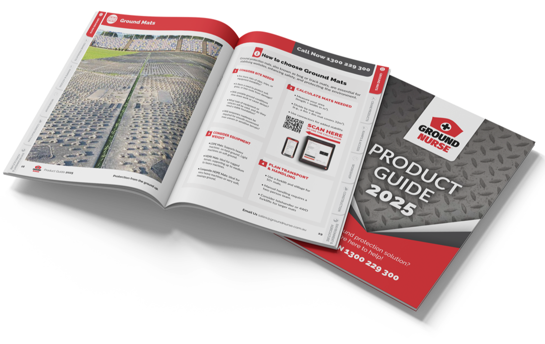
Product catalogue design with a modular layout system for consistency and easy updates
Sales and marketing templates including proposal and quote templates built in InDesign for ongoing use
How a tiny company can present so well when its material is high quality.


Arnold Rendell
General Manager, Ground Nurse
The Result
The refreshed identity gave Ground Nurse the clarity and confidence to compete with larger players in the market.
Outcomes included:
Stronger market presence through a unified visual identity
Improved client confidence during quoting and tender stages
Greater internal efficiency through editable, consistent templates
Increased enquiries and visibility at industry events
This wouldn’t have been possible without the work.
Arnold Rendell
General Manager, Ground Nurse
What’s Next
With strong brand foundations in place, the focus shifted to growth:
Updated brochure system
Sales enablement tools
Digital-ready assets
Continued strategic design support
This phase built on the clarity and structure established through the initial rebrand.