
NPL & Football NSW Leagues – 2026 Season
Shaping a long-term creative direction that reflects how football is really experienced.
Industry Sport, Football
Scope Creative direction, visual system design, content and storytelling framework
We wanted a brand that spoke to the heart of our audience. The players, the fans, the ones that were sharing it on social.


The Challenge
NPL and Leagues football already has a strong culture. The challenge wasn’t to invent one.
The issue was representation.
For many fans, players and clubs, the competition no longer begins at the gate. It begins on their phone.
Graphics, photos, video, commentary and headlines needed to feel aligned with the reality of the football being played. Suburban grounds. Rivalries. Ritual. Emotion.
The task was to create a creative direction that felt honest to matchday culture, could be applied consistently across an entire season, and would hold relevance beyond a single year.
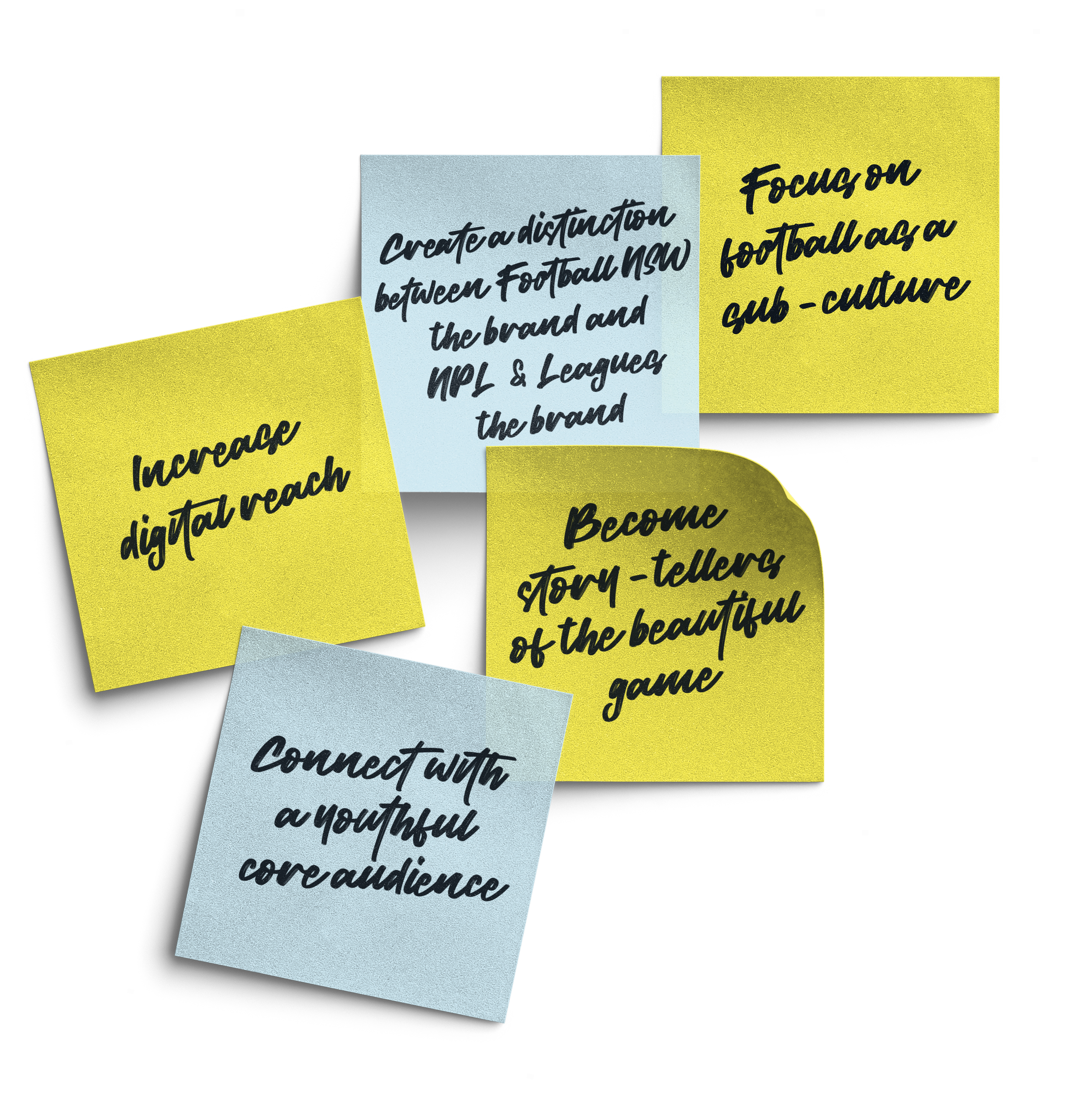
The Objective
To build a long-term creative platform that would:
Represent the reality of NPL and Leagues football honestly
Create consistency across social, digital, broadcast and editorial touchpoints
Appeal to a culture-led eighteen to twenty-five audience without excluding the wider football community
Allow the competition to be recognised instantly through look, feel and tone
Be built to last beyond a single season
This was not about launching a campaign. It was about setting a direction.
The Strategy
Everything was anchored to one idea.
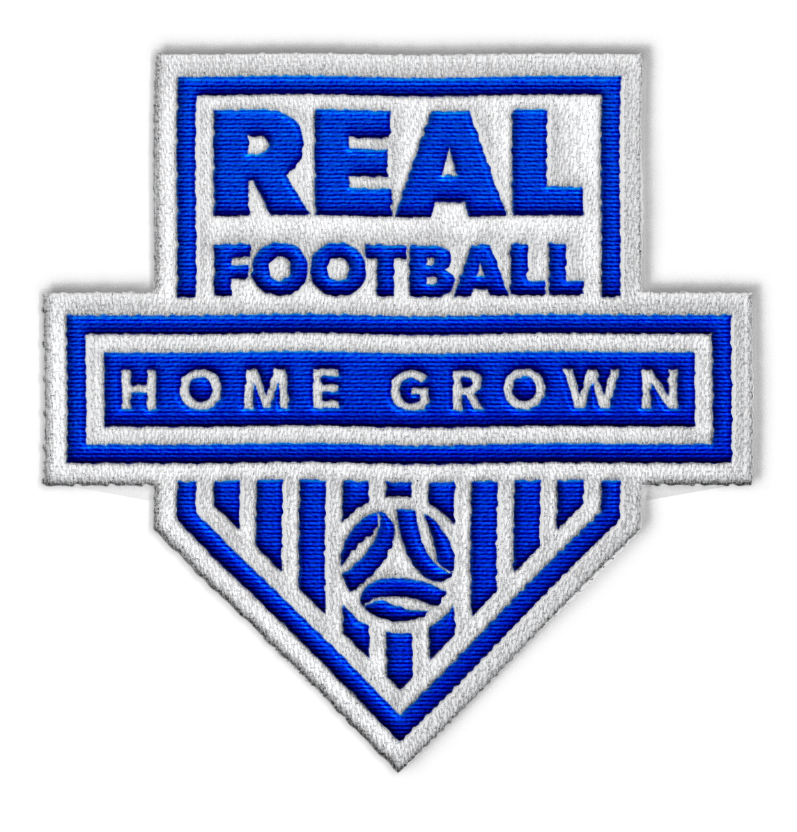
Real Football. Home Grown.
This became the platform for how the competition would be shown, spoken about and experienced.
Home Grown speaks to place. Local grounds. Local clubs. People who have been part of the game for years.
Real Football speaks to feeling. Raw. Emotional. Competitive. Imperfect.
The strategy focused on building meaning through repetition. The more the idea appears across the season, the more it becomes owned by the people already part of it.
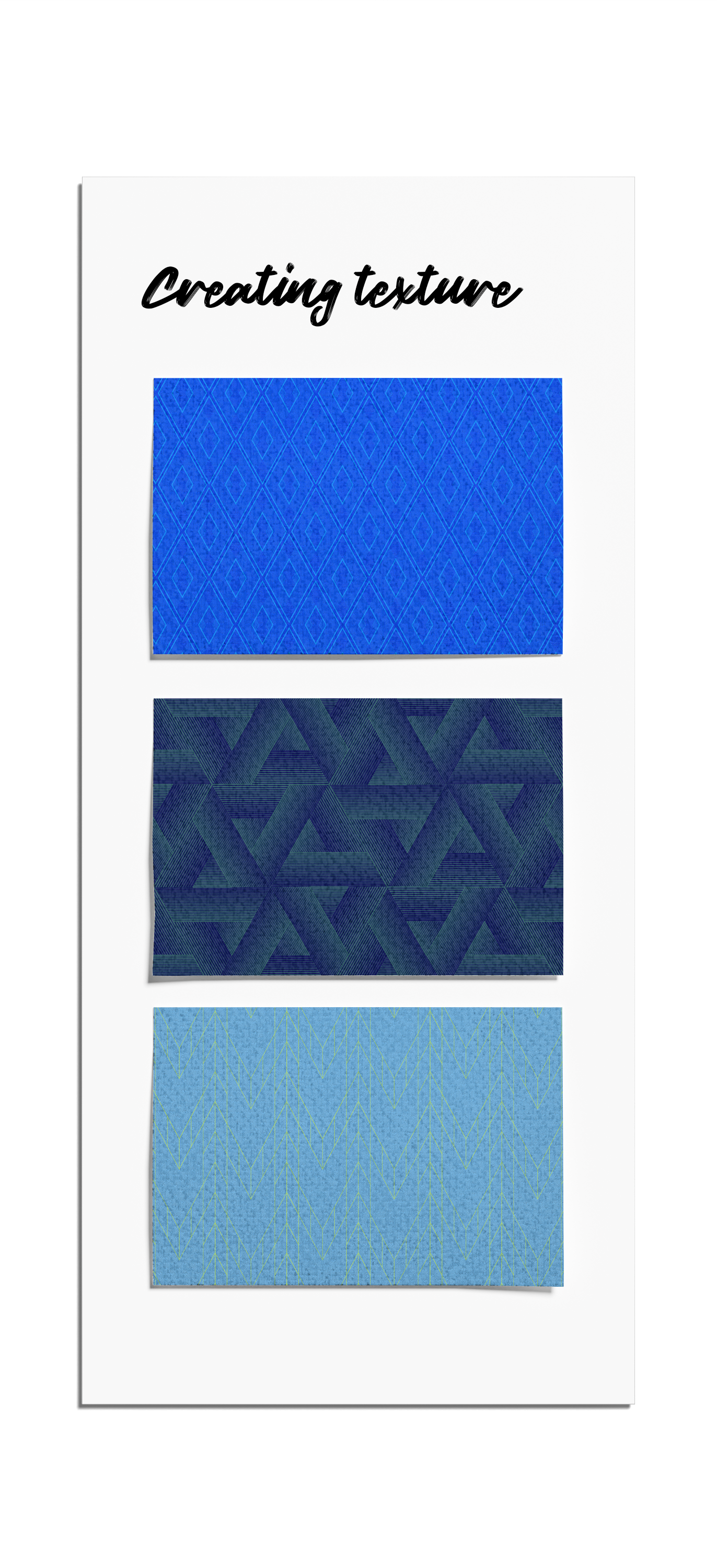
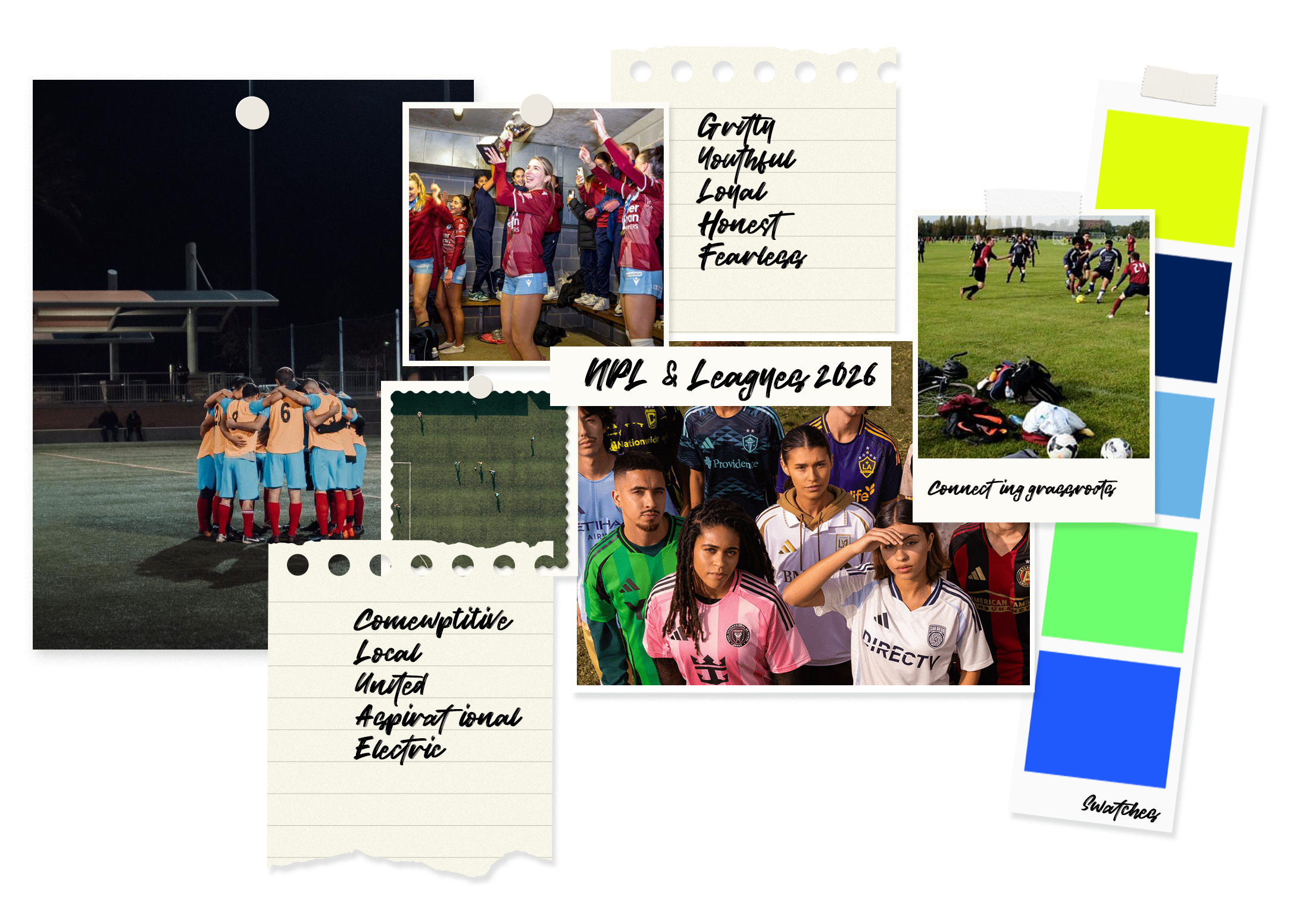
Ideation & Creative
The creative exploration began with texture.
Rather than starting with logos or layouts, the focus was on surfaces and materials that already exist within the game. Fabric patterns, worn ground textures and repeating forms drawn from football kits and matchday environments.
These textures became the foundation of the visual system. They add depth and atmosphere without overpowering the football, allowing graphics to feel grounded, tactile and lived-in.
The intent was to create a visual language that feels familiar to the game, but considered in its execution. Subtle repetition, imperfection and layering give the work energy, while still allowing clarity to lead.
The Brand Suite
At the centre of the system sits the Real Football. Home Grown. badge.
This is not a campaign logo. It’s a marker. A stamp that can be applied year after year to signal the type of football being represented.
Around this, a flexible visual system was built to support the season, including:
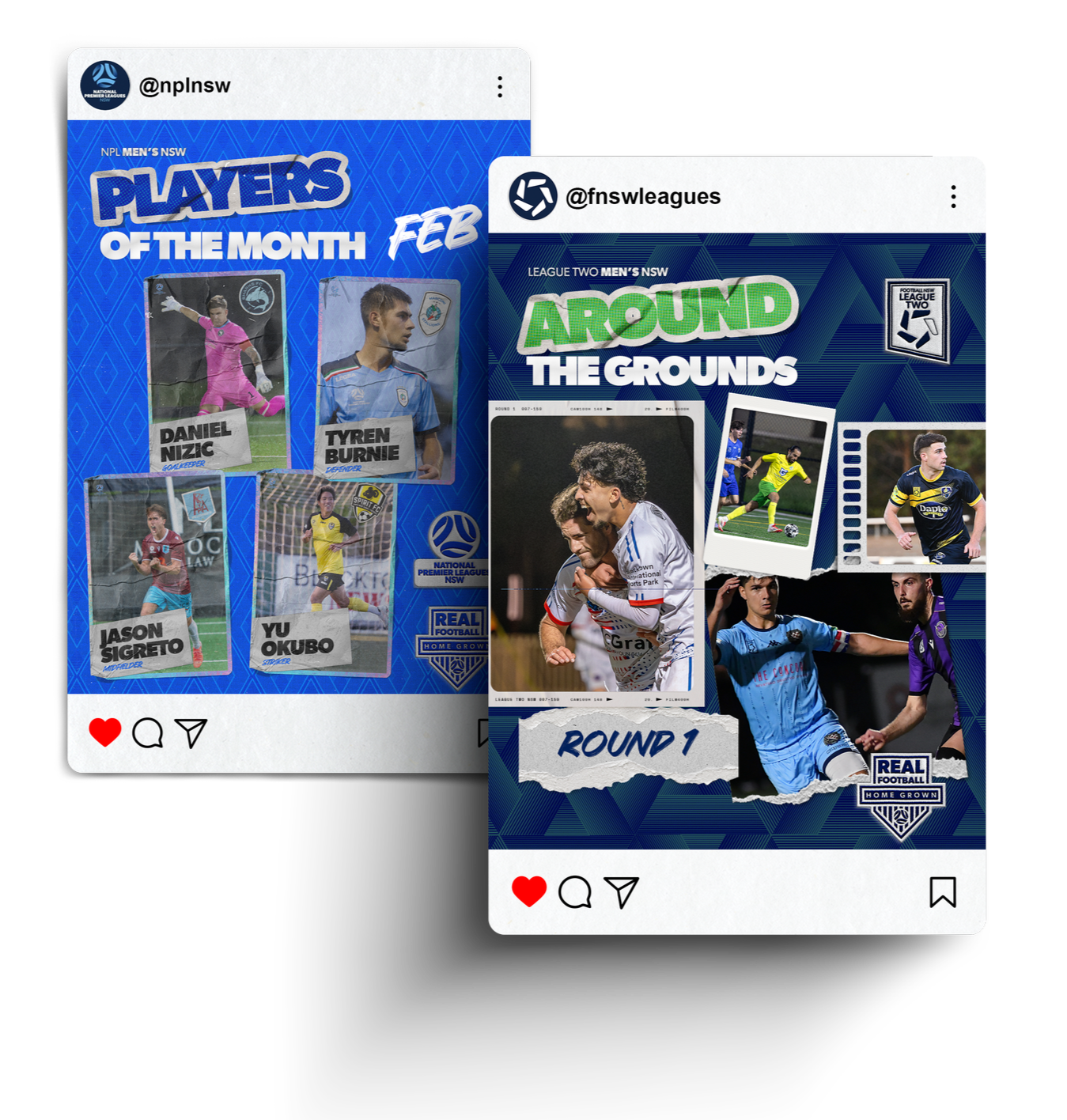
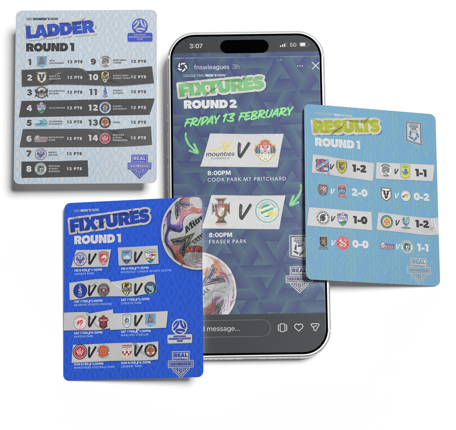
A consistent graphic language for fixtures, results, ladders and countdowns
League-specific textures and patterns tied back to the competitions
A restrained colour palette built around night games, contrast and atmosphere
Typography and layout rules that allow variation without losing recognition
The system is designed to flex across the season while remaining instantly identifiable.
The Brand In Action
The creative direction is live across all core season touchpoints, including:
Fixtures, results and ladders designed for clarity and fast consumption
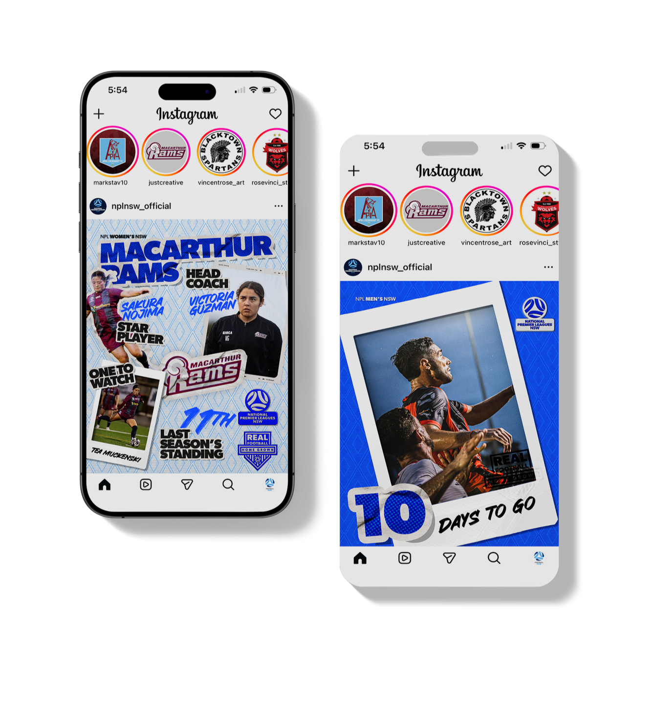
Countdown graphics that help set the rhythm of the season
Player features, Dream Team, podcasts and guest content treated as part of the same world.
Video and motion that prioritise sideline perspective, handheld footage and human moments
Everything lives within the same visual and tonal framework, allowing the season to feel cohesive rather than fragmented.
The Result
The creative direction was first presented to local media, including commentary teams, journalists, photographers and content creators ahead of the season kickoff.
The response was immediate and considered. Media teams understood the intent of the direction quickly and expressed confidence applying it across coverage, content and storytelling.
Pre-season performance reflected that shift.
Compared to 2025:
NPL NSW pre-season impressions increased from 131K to 1.35M (+929%).
FNSW Leagues pre-season impressions increased from 17K to 186K (+979%).
That momentum carried into Round 1.
NPL NSW impressions increased by 593% year-on-year (117K → 814K).
FNSW Leagues impressions increased by 2,916% (9K → 295K).
Engagement metrics, including likes, comments and follower growth, also increased significantly year-on-year.
Internally, the response was equally encouraging. Staff teams saw the value of having a clear and consistent framework, and those within the core eighteen to twenty-five audience felt the direction already reflected how they experience the competition.
The creative provided a shared reference point — one that could be used, adapted and built on week after week.

The Reflection
This work was never about dressing the competition up.
It was about showing it as it is.
By listening closely to how people experience NPL and Leagues football, and designing from that truth, the creative direction becomes something the competition can grow into, rather than something it needs to keep reinventing.
This was about connecting fans to the football they love. The football they turn up for every weekend. The football kids are lacing their boots for, hoping to be part of it one day.